When not to build: Validating assumptions through user testing
AT planned to invest in building a mobile version of the core internal staff tool. Through rapid prototyping and user testing, we discovered that the mobile experience would likely see limited adoption. Instead, research revealed greater opportunities to improve the existing desktop experience.

Image sourced from Auckland Transport's public materials about the Auckland Transport Operation Centre.
Context and constraints
The client had already prioritised this work for delivery, and wanted this to be designed and tested.
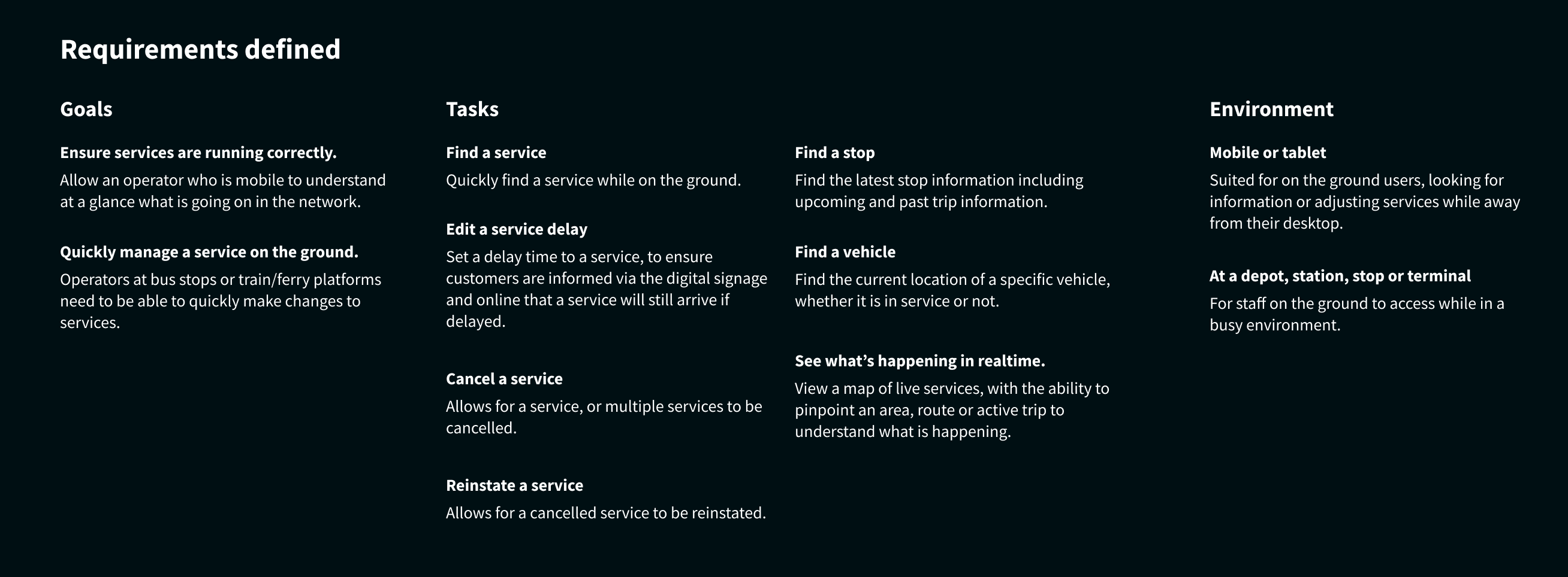
AT requested the development of a mobile experience for their internal platform. This platform manages a large scale transportation network, which contains a lot of information, and complex tasks. The assumption was that users needed access to the tool while away from their desks, and that a mobile interface would increase flexibility and productivity for staff.
Problem
The key question became: Should this be built at all?
The organisation had already begun defining requirements and planning work for the mobile experience. However, there was limited evidence that users actually needed or wanted to use the tool on mobile devices.
Building this experience would require significant engineering investment, and existing improvements had already been identified via a UX audit I previously conducted.
Key insights
Testing revealed a larger, underlying need that was not directly related to mobile at all.
My role
Leading the conceptual design, and testing of this new mobile experience.
- Led the conceptual design of the new mobile experience
- Ran user interviews and user testing
- Synthesised findings into clear recommendations
- Delivered a report outlining key recommendations and next steps
UX Audit
I had previously conducted a UX audit on the existing desktop experience.
A prior UX audit had already outlined several areas of improvement within the existing experience. The findings were delivered in a report with clear recommendations for improving navigation, filtering, certain core workflows, accessibility and creating more consistent design patterns.

Example outtake from a prior UX audit report.
These findings created an important backdrop for the validation work. They highlighted clear opportunities to improve the existing tool experience, which became a critical input when evaluating whether a new mobile experience should be prioritised.
Approach
My hypothesis: There are bigger priorities that should be addressed first.
The client had identified key workflows that they wanted the system to support. To test the hypothesis, I developed a conceptual mobile prototype that represented these workflows.
The goal was not to design a production-ready solution, but to simulate how the system might behave on mobile devices.
While conceptual, this prototype was mid to high fidelity, and involved a realistic representation of information. I began by mapping out the core information, workflows and actions that would be required and used this data to built out the workflow.
I then conducted user interviews and usability tests with real users to understand:
- Whether the users needed mobile access
- Which tasks users might realistically perform on mobile
- Whether the identified workflows were usable on smaller screens
Conceptual design and prototype creation
Designing a realistic, testable concept before committing to a full build.
To meaningfully validate the mobile experience, I needed a prototype that felt real enough for staff to respond to. I started by mapping the key workflows, information hierarchy and entry points that the client wanted supported on mobile.
From there, I created a mid-to-high fidelity conceptual design that balanced clarity and speed – detailed enough to surface real usability issues, but flexible enough to evolve quickly as we learned from testing.
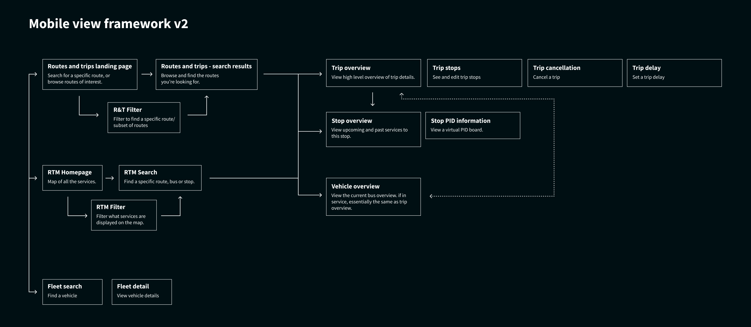
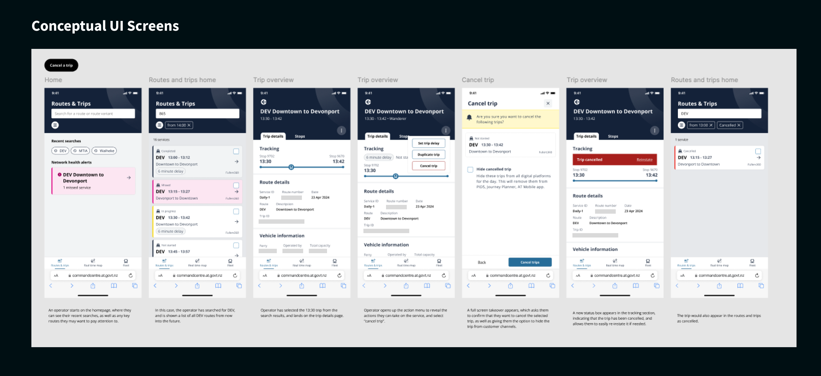
Selected frames from the conceptual design and prototype used to explore how the internal tool might behave on mobile.
Testing
Across 14 users, with multiple needs, and one common shared goal.
As this tool is an expert tool, used by many, including internal staff and third party companies to manage the network, 14 users, all with different complex needs were interviewed.
Each session was split into two stages.
First, an exploratory interview to understand existing workflows and identify when mobile access might be useful.
Second, users were asked to complete common tasks using the mobile prototype while I observed their interactions and collected feedback.
Findings
Testing revealed a larger priority needed to be focused on first.
While participants initially thought mobile access could be useful, further discussion showed that it was largely a nice-to-have rather than a real-world need. Most users preferred to complete tasks at their desk because the workflows were complex, required large amounts of information, and had a significant customer impact.
A few edge cases emerged where mobile access might be useful, such as staff who were not desk-based or during building evacuations. However, these scenarios were infrequent and did not justify building a full mobile experience.
When it came to the research findings, I discovered there was a much more pressing theme that emerged that did not reflect a need for a mobile experience. Through this process, we came to the realisation that the core tool was not yet addressing the needs of all users efficiently. This was a greater value item, and the recommendations I provided outlined this core need.
Outcomes
The validation process demonstrated that while a mobile experience could technically work, it was not a high priority for users.
After presenting the findings and recommendations to senior stakeholders, the mobile initiative was paused. Instead, the team prioritised improvements identified during the UX audit and testing, focusing on enhancing the existing experience.
This shift prevented significant engineering investment in a feature that users were unlikely to adopt and redirected effort towards improvements that delivered immediate value.
Reflections
This project reinforced an important principle of UX design: design is not just about creating solutions, but validating whether a problem actually exists or needs solving.
By testing the mobile concept early, we were able to move the conversation from assumptions to evidence. This allowed the team to prioritise work that delivered greater value to users first, while avoiding unnecessary development.