Designing Design Systems that scale
Many organisations struggle to implement design systems that are adopted and scalable. I partnered with cross-functional teams to define strategy, design reusable components, and integrate governance and tooling, enabling teams to work more efficiently, maintain visual consistency, and embed a culture of scalable design.

Problem
My challenge was to help organisations design systems that actually scale, balancing efficiency, flexibility, and real-world team constraints.
Many organisations invest in design systems expecting immediate efficiency and UI consistency. In reality, adopting without a strategic approach is often messy. I've been on both sides of the story.
Teams frequently jump straight to building components without first defining strategy, governance, or team workflows. This leads to:
- inconsistent components
- unclear ownership
- fragmented adoption across teams
Context and constraints
Different organisations have different requirements
Across multiple engagements I worked with organisations at varying levels of design and engineering maturity. Some teams had limited design system culture, while others had fragmented systems already in place. A common constraint across projects was time. Teams were still delivering products while trying to implement new systems.
This meant success depended on identifying the highest value improvements early, and balancing long-term system quality with immediate team needs.
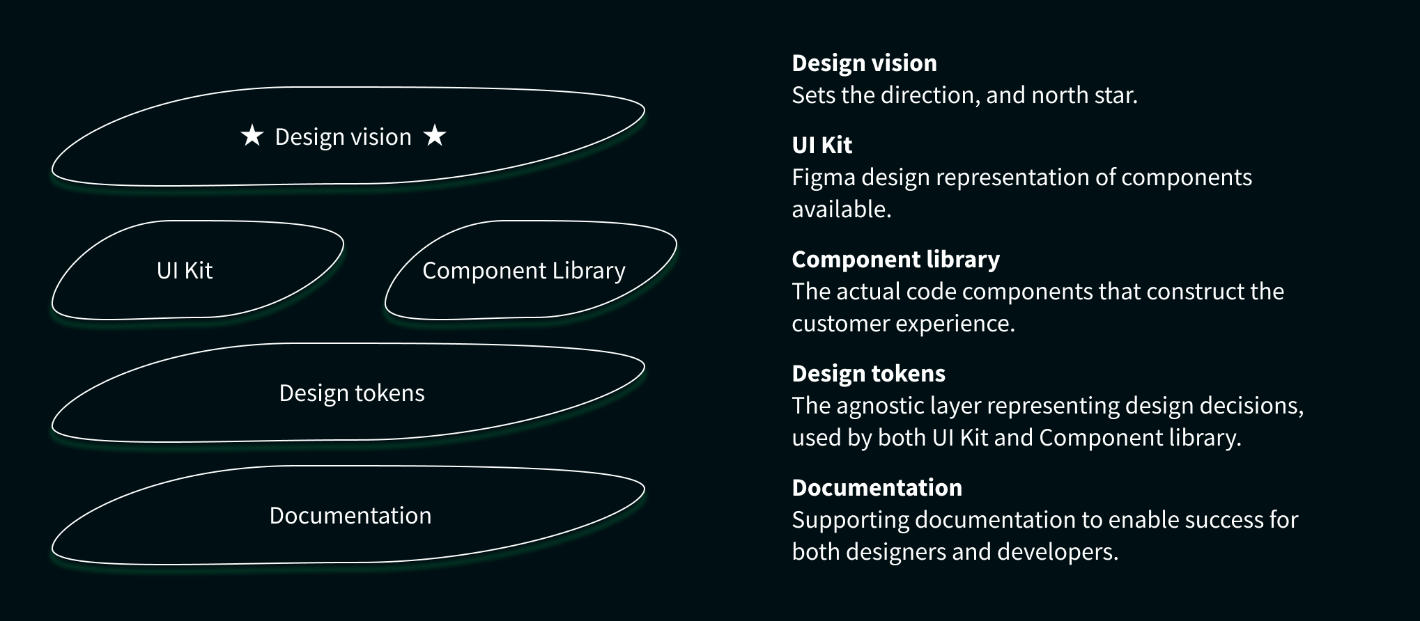
Simplified example of the typical core building blocks of a design system, and how the pieces fit together.
Key insights
My role
Leading and supporting the successful launch and adoption of Design Systems.
- Lead the rollout of a new design system from the ground up, including strategic support
- User testing design systems with both designers and engineers
- Delivering high quality Figma components
- Creating and maintaining design tokens and other design-owned features, applied across Figma and front-end components
- Planning and prioritisation with design system leadership teams
- Mentoring other designers, enabling them to build and maintain systems at scale
- Implementing documentation to meet the needs of multiple audiences
Strategic approach
Jumping into component creation in isolation rarely leads to a truly successful outcome at scale.

One of the most common mistakes I have seen over the years, and made myself, in design system initiatives is failing to identify the real needs of the teams involved.
My approach begins by identifying organisational gaps and prioritising areas where a system can create meaningful value quickly. Adoption becomes the key measure of success.
Before defining a system strategy, or implementing anything, I evaluate:
- Design maturity and clarity of product vision
- Development maturity and component architecture
- Organisational commitment and funding
- Realistic delivery timelines
Core pillars of the system
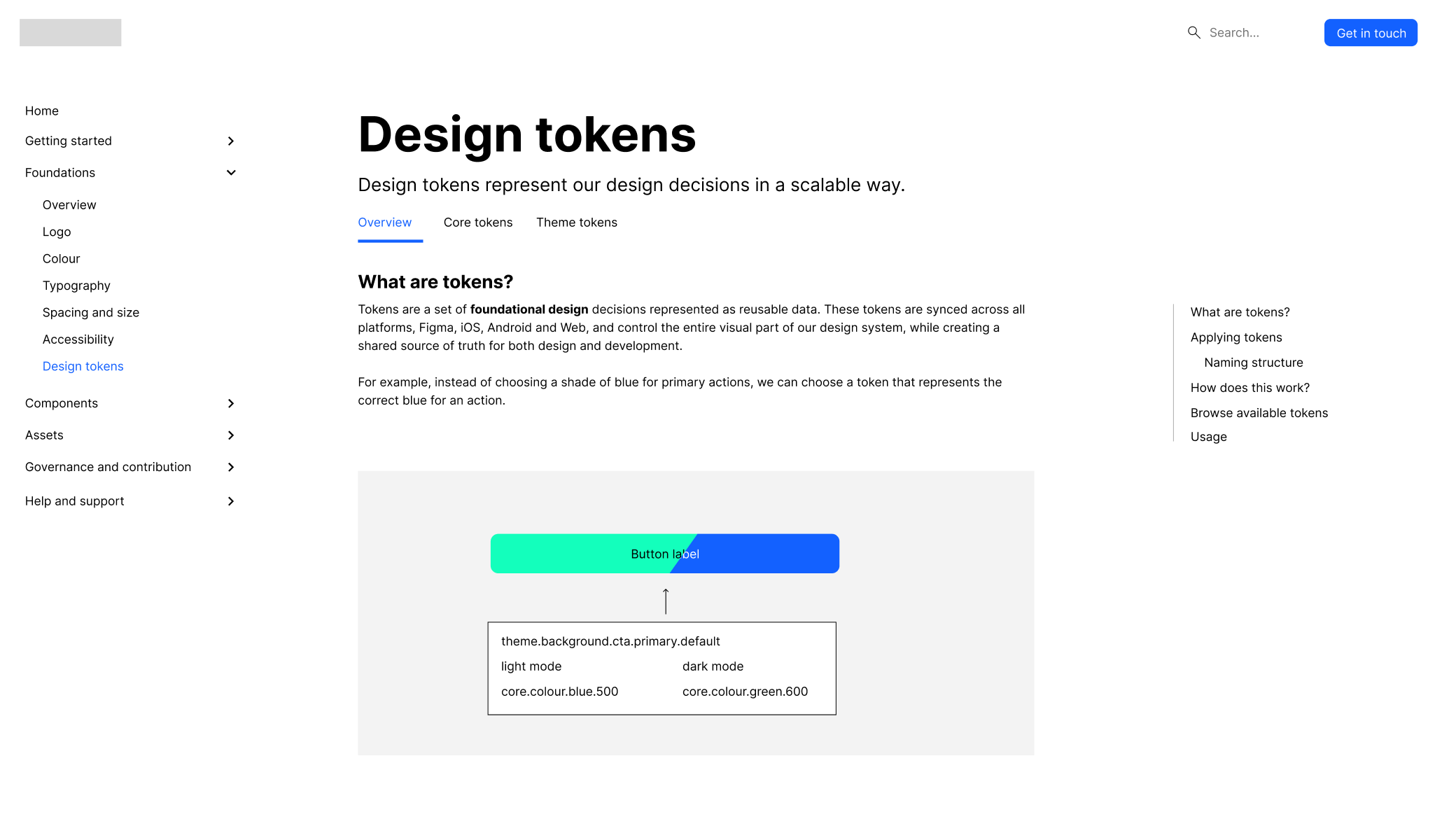
Design tokens & Multi-Brand systems

Multi-product companies often struggle to maintain visual consistency or require maintaining multiple systems and libraries without a clear approach.
I've implemented design tokens as the foundational layer connecting design and engineering. Systems can have varying levels of complexity, depending on the system's current or envisioned needs.
This allows for:
- Consistent colour, typography and spacing across products
- Brand flexibility without rewriting components
- Alignment between Figma and front-end technology
This is critical to ensure that change is able to be applied at scale, without requiring large re-works, or maintaining multiple libraries. This also enables:
- Faster brand customisation
- Improved consistency between products
- Reduced design and development duplication
Documentation that users actually use

Many design systems overcook themselves, because documentation is written like a complex manual. Designers rarely read long documentation. Documentation adoption increases significantly when guidance is embedded directly within design tools like Figma.
Documentation should be designed like a product experience, not a static reference manual. Understanding the audience, and how to best speak to them is valuable. "Designers don't read". I focus on:
- Identifying core audiences (designers, developers, product, marketing)
- Creating self-documenting components where possible
- Structuring documentation that meets each audience best where they work
In a past engagement, I designed a documentation system supporting both designers and developers. For the developers, it was very useful, however for the designers, it was more cumbersome to find and effectively use. This learning had introduced a need for certain documentation to also live or integrate well in Figma, meeting the designers directly where they work, and be easy to find. Examples and pictures become much more powerful than just defining each rule.
This adjustment in approach led to:
- Higher adoption by designers
- Fewer repeated questions by the design audience
- Easier onboarding for new users.
User testing the design system
Design systems are rarely tested with their primary users - designers and engineers. Without testing, systems risk:
- Confusing component usage
- Poor documentation discovery
- Inefficient workflows
Incorporating UX approaches has created large value, through tools such as:
- User testing Figma libraries with designers, to understand both capabilities and needs
- Observing real usage of the system to identify areas of improvement
- Iterating tools based on feedback
This has clearly led to:
- Improved usability of the tools
- Faster component adoption
- Reduced error, and prioritising features and approaches to best support the real users
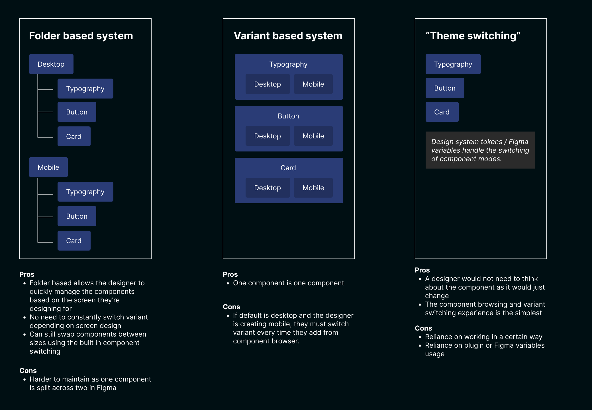
Example of a user test where different methods of working were trialled.
Outcomes
- Delivered a new design system for a large technology scale-up supporting multiple products and brand experiences
- Increased designer and developer satisfaction in utilising the system
- Increased adoption through collaborative governance models
- Enabled teams to ship faster using shared components and design tokens
- Delivered system rollout ahead of initial timelines
- Established robust documentation, and support structures for teams

Example snippet from a past design system's UI Kit in Figma
Reflections
Design systems are often framed as component libraries, and understandably so - it's practical. The real challenge is understanding and designing the organisational system around them, and identifying what the underlying "existing component system" will meet the long-term needs for the company, if applicable.
It's also critical to ensure alignment early, as everyone has an idea of what a design system is, but what they're picturing themselves is often vastly different. Not taking this into account, things can go rogue pretty quickly.
I've learned that successful systems balance:
- Governance (without restricting or just telling people what to do)
- Accessible documentation
- Clear alignment
- Continuous feedback from the teams using them
When these elements align, design systems become a powerful foundation for scaling product teams, improving speed, efficiency and consistency.