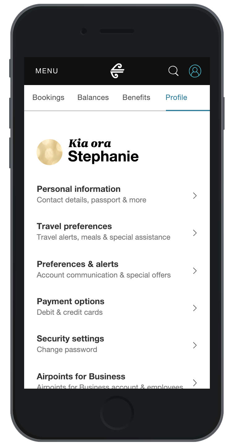
Member preference centre (Profile)


Overview
Create a prototype to test a new product that had to be released due to GDPR legal requirements.
In 2018, the rules around customer data and access to information changed. This was due to the General Data Protection Regulation (GDPR) going live. This meant that Air New Zealand had to change the way customers access their data to ensure the company was operating within standards.
Previously, the profile section of the website had not been updated to follow the new Unison design system rules, as it had not had any major work done for a while. This project meant that the visual style and flow that customers see and use was open to being updated - aligning with the new style.
At the time of this project, the design system was still in it's early stages and some design patterns had not yet been established. This project would go on to influence the components that are in Unison today.
Atomic.io
I was tasked to create a realistic product experience as a way to test new design patterns. It was decided that we would explore the prototype utilizing a dataset (spreadsheet with all the copy) so that the product manager and other designers could influence the copy without having knowledge on how the prototype was setup (and more importantly, so they could make the changes without breaking the prototype or me having to make all these minor changes for them.) It also had to contain complex flows and states so that we could test the interactions with people to see whether the design patterns were understandable or not.
The prototype
This section of the prototype shows a customer their travel preferences section. This includes the ability to select items from a drop down menu (meal preference & special assistance) and toggle check boxes on or off (methods of communication).
This section shows the account information section. It is a list of check boxes that let users select which products they get communications from us about.
This is the largest section of the prototype and required the most work and iteration. It's the section that controls the communications of all of the products, flight details and partners. This is a long list, especially since we had to include each destination we fly to.
This is an older version of the communications section. It contains a permissions section that requires three tick boxes to be activated before a user can interact with the page. This section was later removed as it added too many complexities for the user. It's a good example of complex logic in a prototype.
At the time of recording the clips above, some components of the prototype have become bugged. (Buttons and check boxes)