Reimagining Customer Communications: Post booking communications

Overview
45% of calls to the contact centre are booking related. Many of these queries the customer can now self-service or can be resolved without calling up.
Air New Zealand had a massive surge in disrupts due to the fuel line that supplies Auckland airport breaking, as well as the Rolls Royce engine issues that caused the dreamliner fleet to be grounded until new engines could be installed. These events revealed a weakness in the communications currently sent and a desire to drive increasing a customers ability to self-service themselves.
We dediced to identify opportunities in the email communications where Air New Zealand could assist customers to self-serve, reduce related calls to the contact centre and increase retail revenue.
Allen Huang (Senior UX Strategist)
Tools usedSketch
Abstract
Zeplin
Realtimeboard (Now Miro)
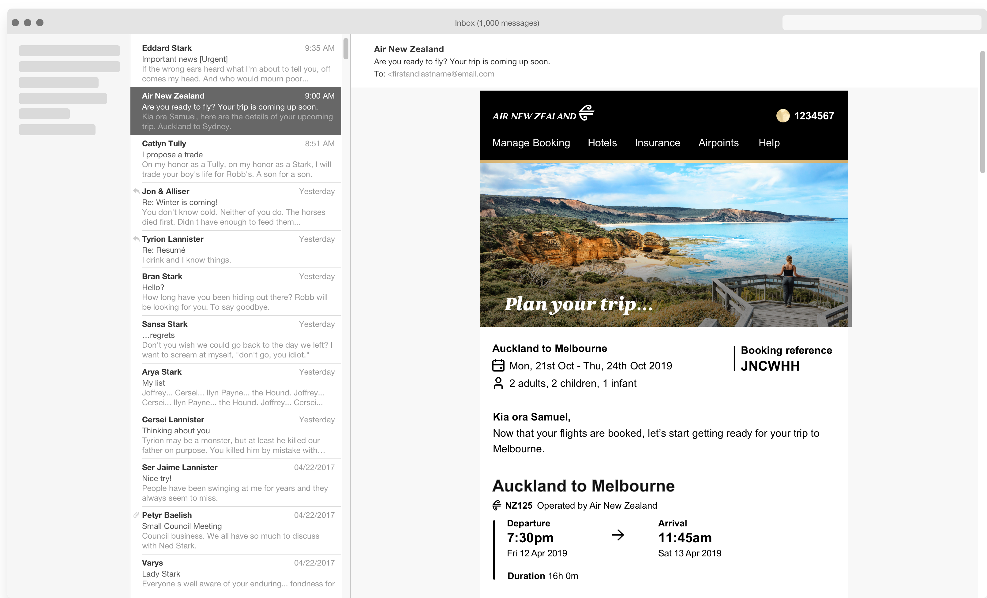
We re-designed the content strategy for the emails that are sent to customers to be more useful and helpful at each stage of the customer journey that they are sent at. We also visually updated the design to align with the design system at Air New Zealand known as Unison.
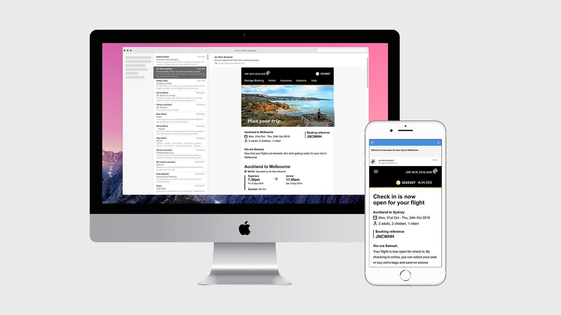
I was the UX designer on this project, working closely with one of the senior strategists to create a new email set, starting with the most crucial to the customers: the post booking communications.
We re-imagined what emails we sent, why we sent them, what content they contained, and funneled email component designs to the Unison design system.
The design process
The initial brief was to conduct a design review on one of the post booking emails which had been re-developed with inspiration from Unison, the design system. The email's style was heading in the right direction, however there was a clear need for some content strategy and tidying up the design.
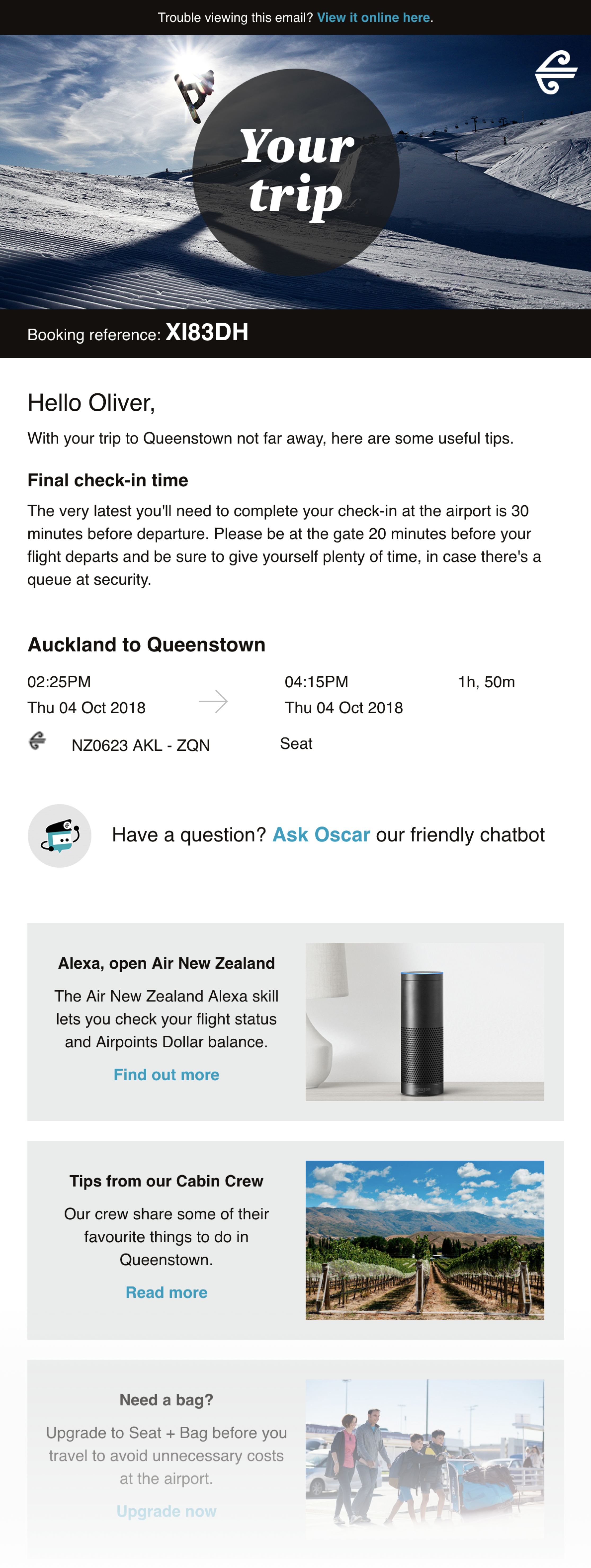
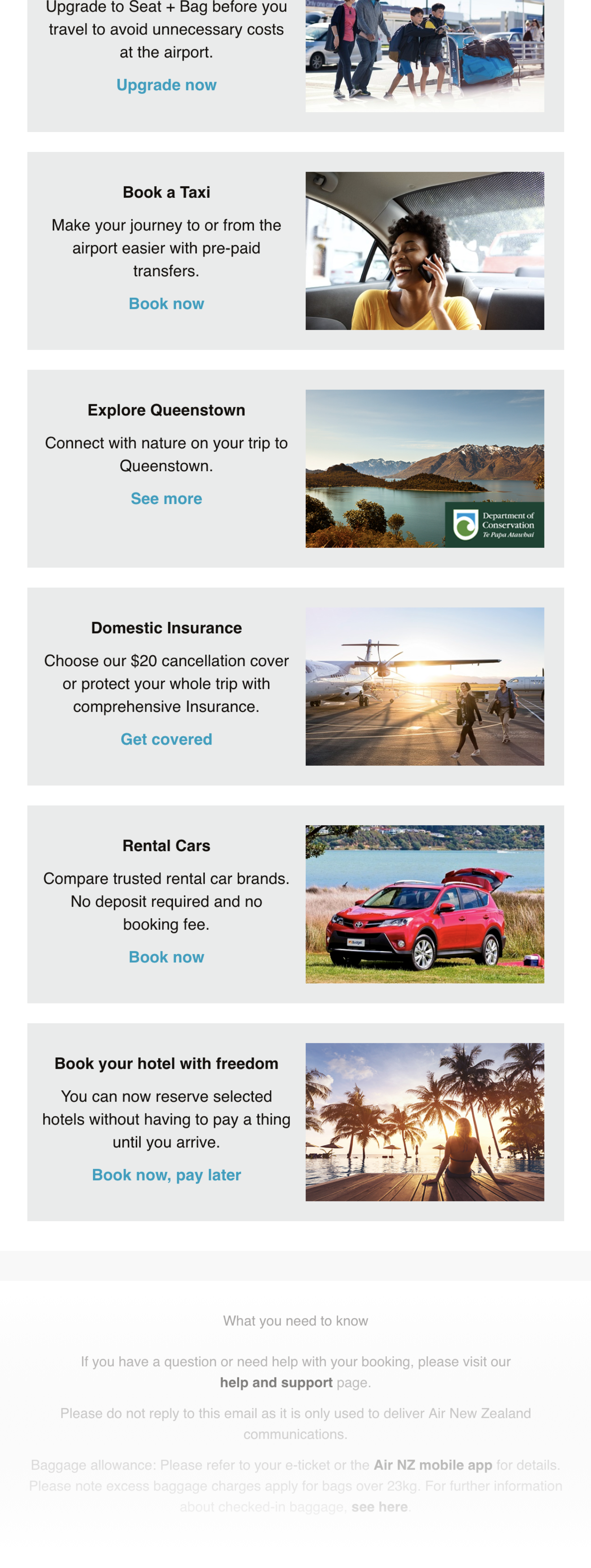
The first email sent for review.
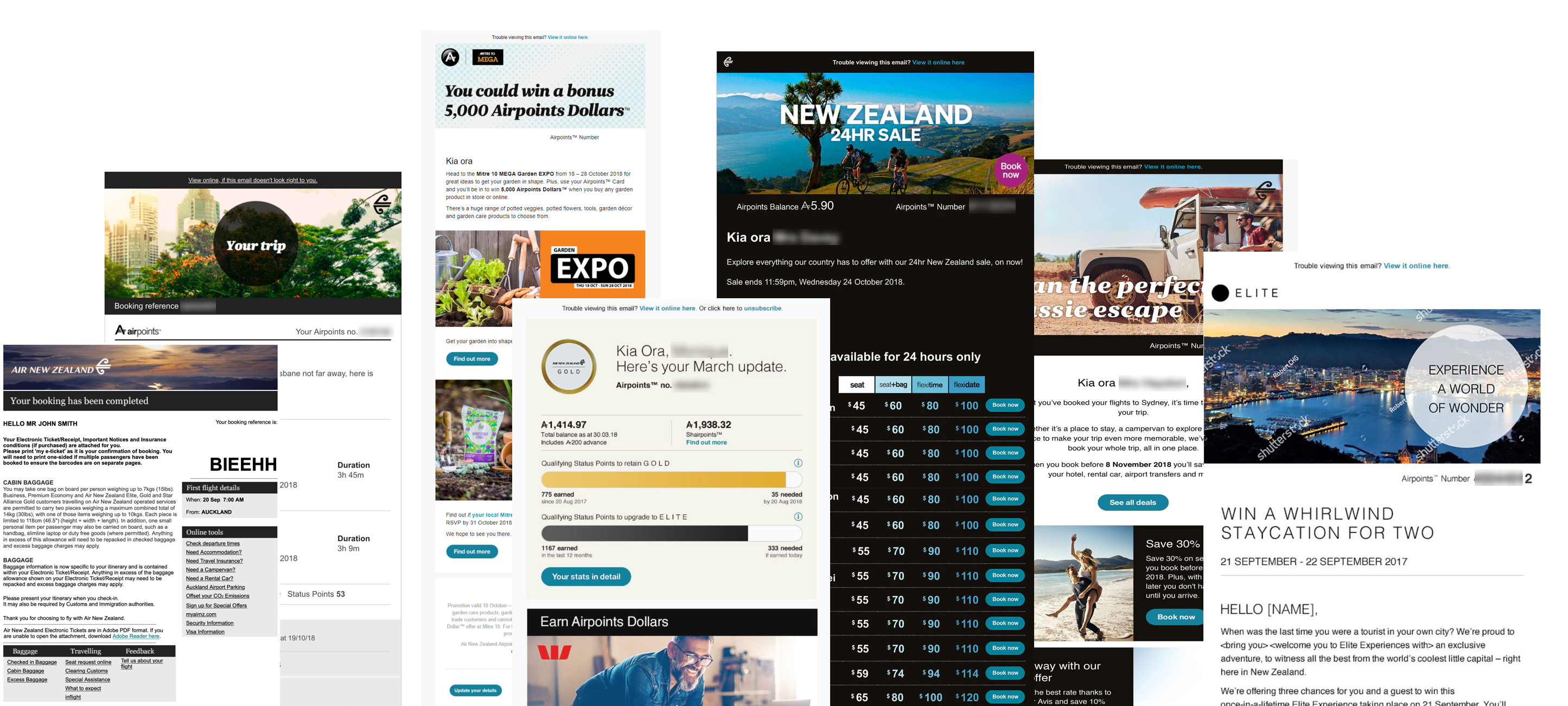
We began by collecting all of the emails we currently send and organising them into different portfolios depending on the teams and intent of the emails.
There are three main portfolios that we highlighted.
Of the three portfolios we did a deep dive into Triggered Comms as this is the most crucial set of emails we send to customers as it relates to their flight information.
There was no logical rationale or consistency on how the email content was presented.
Each block of content was organised into a spreadsheet. This allowed us to have a hollistic idea of what content was in each email. This was crucial for finding content that is across all emails, their positioning, planning re-usable components and to gauge the value of content to the customer in each email.
We had no holistic customer view of the email communication journey.
Up until now, the emails had been designed in siloes. Meaning that each email had it's own priorities, content and design patterns. They were more "business-centric", rather than "customer-centric".
Due to the way emails have been designed previously, there was a lack of consistency both internally and with the final release. Even the way Air New Zealand communicated a customer's Airpoints Number and balance was inconsistent across email communications.
Our hypothesis is that the E-ticket email is the most important email in the customer journey, and should be prioritised and act as the "source of truth" - heading the design of Unison email components.
There was a disconnect between the designs, where they would show the same information in different ways. They also were not designed or developed to be mobile responsive. This is a growing issue with more and more of Air New Zealand's customers viewing these on their mobile devices.
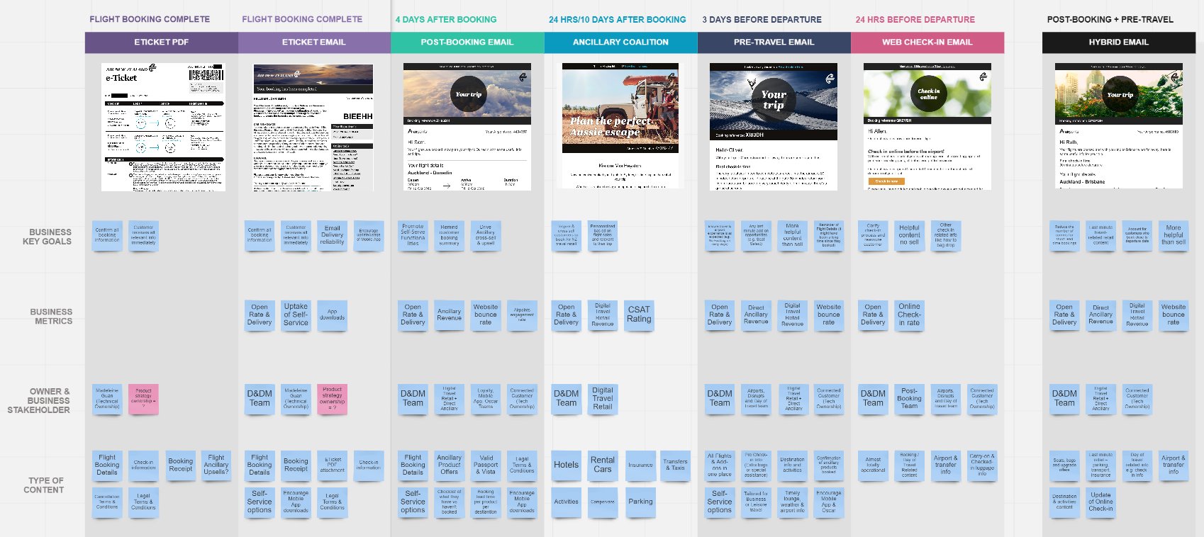
We conducted workshops with the relevant stakeholders. This was to understand more about the emails such as the business rules, business metrics, product owners and finally the type of content the emails contain.
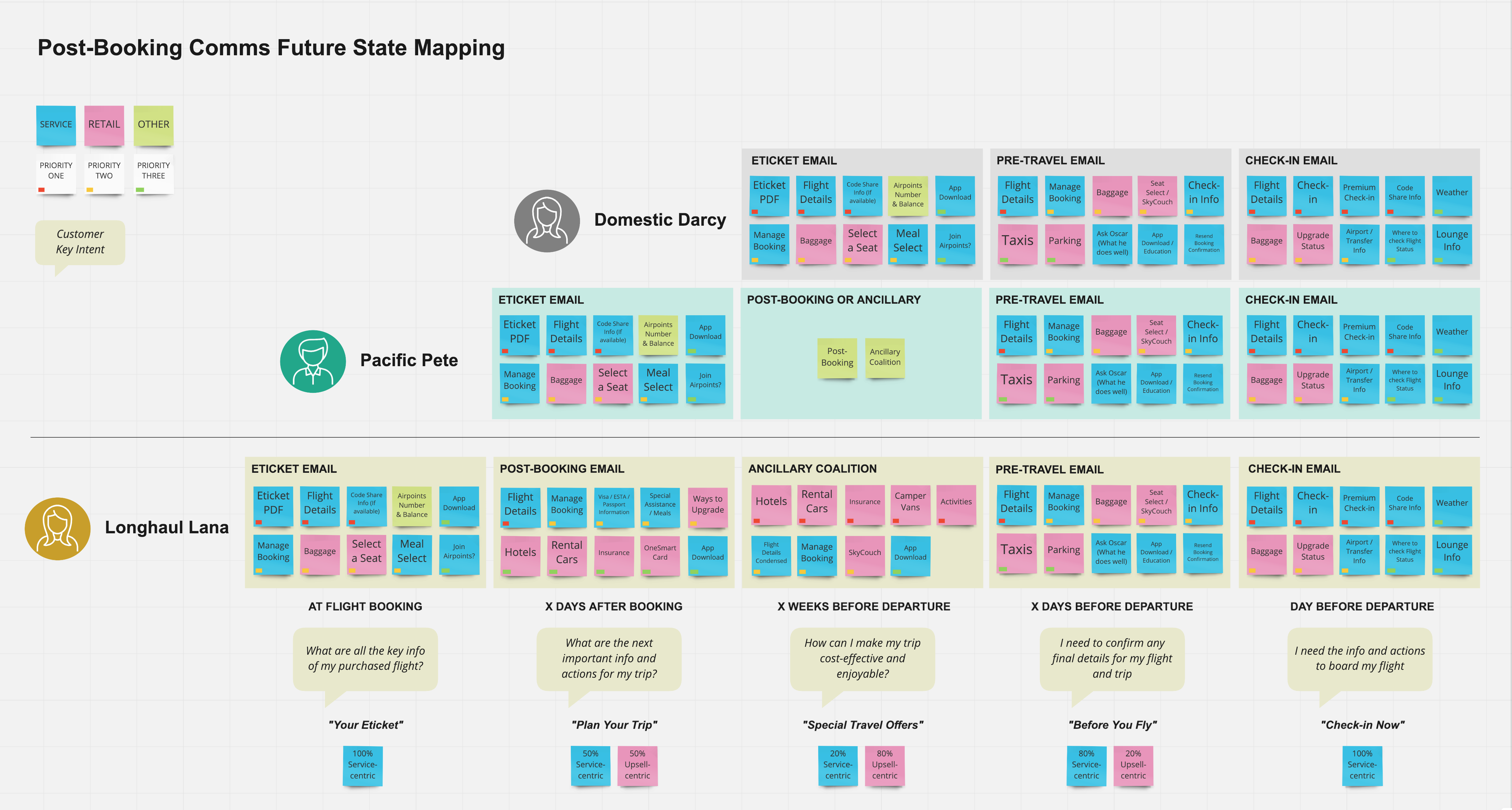
We then planned a second workshop to explore the future state of the emails which was built around the customers needs rather than the current and outdated business rules.
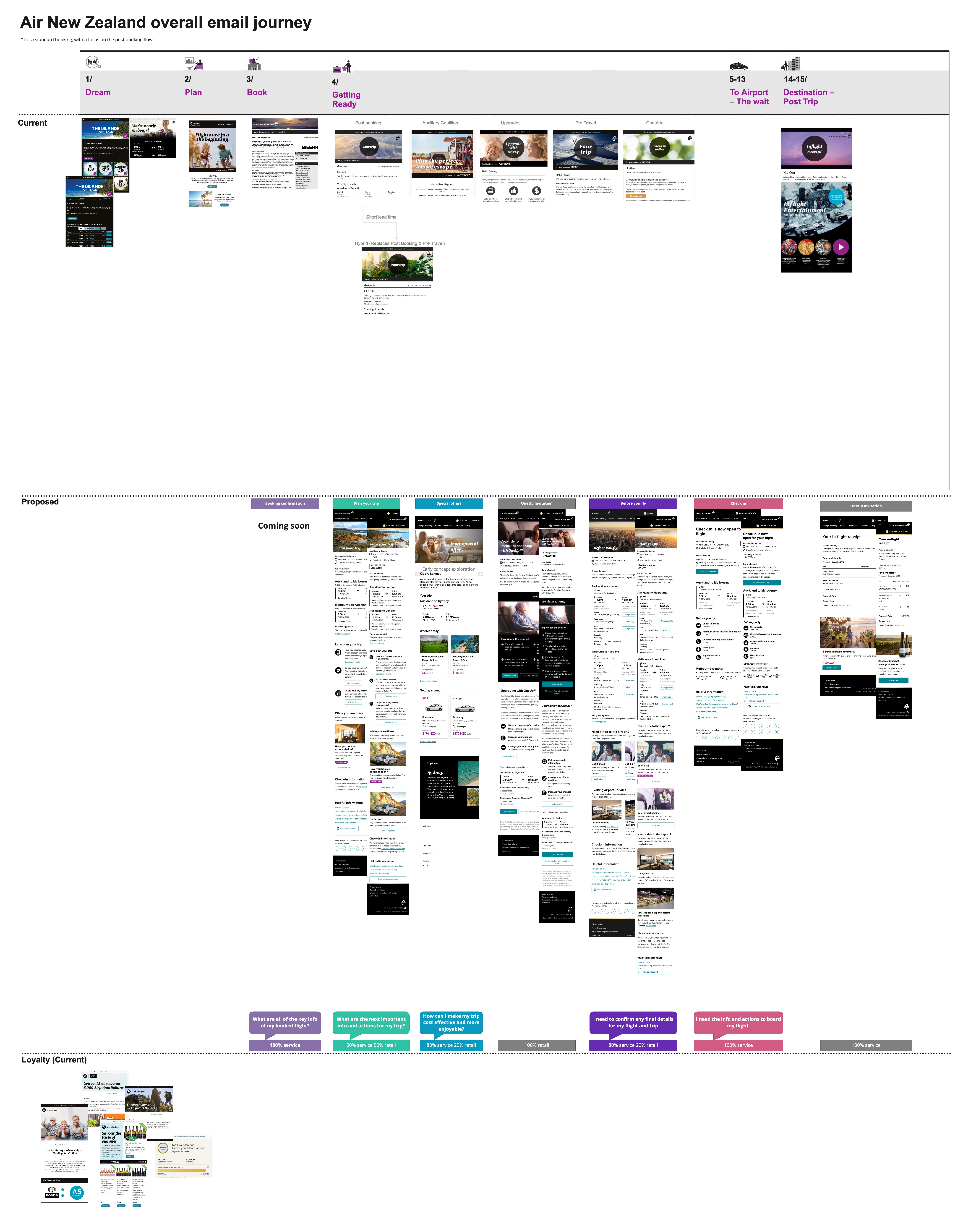
Outcome
(Work in progress)The new email designs have a few core benefits, one of the biggest being the use of reusable components. Previously, each email was developed in siloes, hence all of the discrepencies in displaying information (such as flight details). With this new design (and through knowledge share on how each component is broken up when specing the designs to the external agency to make) the emails should all come from one single design source of truth - the email section of the design system.
You may be interested in:
This project has been split up into two other key sections. Loyalty and marketing explores the process of creating a unified design system for email communications across all portfolios. e-Ticket explores the journey we took to re-design the booking confirmation communication that customers receive to be more useful, easier to understand, clearer to scan and have an overall visual refresh to align with the contemporary brand image Air New Zealand has been developing across it's digital touchpoints.
Personal key learnings
The nature of this project meant it crossed many different teams, stakeholders and business partners. I learnt a lot about managing stakeholders on a large scale.
Design collaborationThere was a large amount of collaboration needed on this project to make it a success. There were many back and forth meetings and inpromptu chats across the team regarding the designs and specific components. Naturally through all of this I found myself working better at sharing back my thoughts and building out stronger sections because of it. Some more complex components required multiple members of the UX team to all swarm around it so to ensure the design is versatile and can be used across all of the products (such as the flight details view)
Working with an external agencyPreparing assets, meetings and speaking with an external agency. I learnt a lot about how to do these things to ensure we deliver delightful products.