Air New Zealand
Airport parking Canterbury

Role UX Designer
Date 2018
Overview
Create a booking form for customers to purchase airport parking at Christchurch Airport through a third party.
I was the user experience designer on this project. I worked with the product manager and the third party developer.
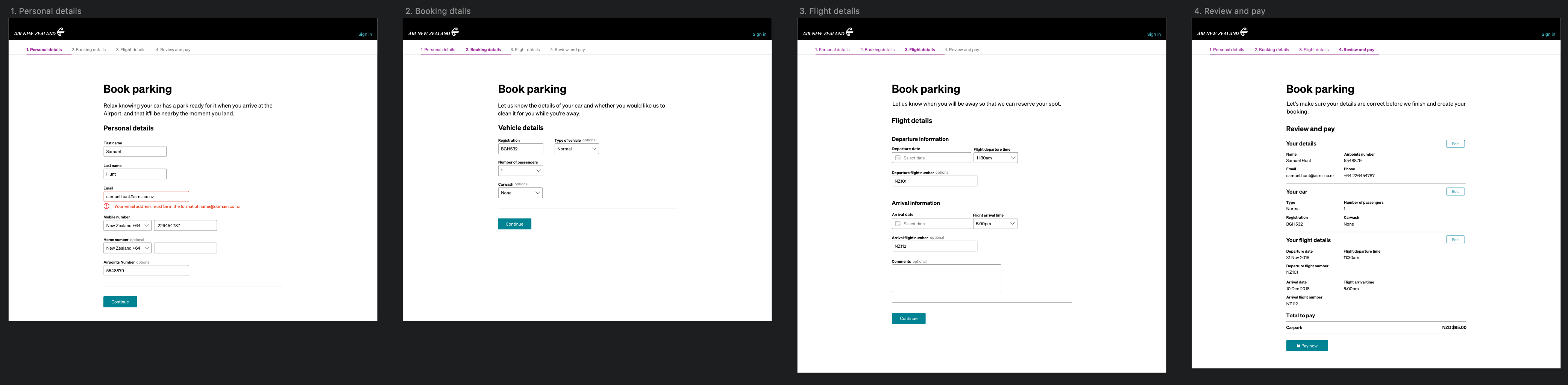
Sketch
The design process
The initial brief of this project was to visually style an existing form in the Air New Zealand style.
Right away I noticed many flaws in the design of the form which would lead to problems for the users if developed in it's current state. I decided that it would have been a waste of time and development cost purely skinning the current form and so I proposed to make a couple of changes. I joined this project pretty late into the project and so I aimed to go for quick wins that would still let this product get out the door in time for the launch date.
Unfortunately, due to the late timing that UX was briefed into this project, and the extremely limited backend, there was little room for the recommended design to be created and so a lot of comprimises had to be made.
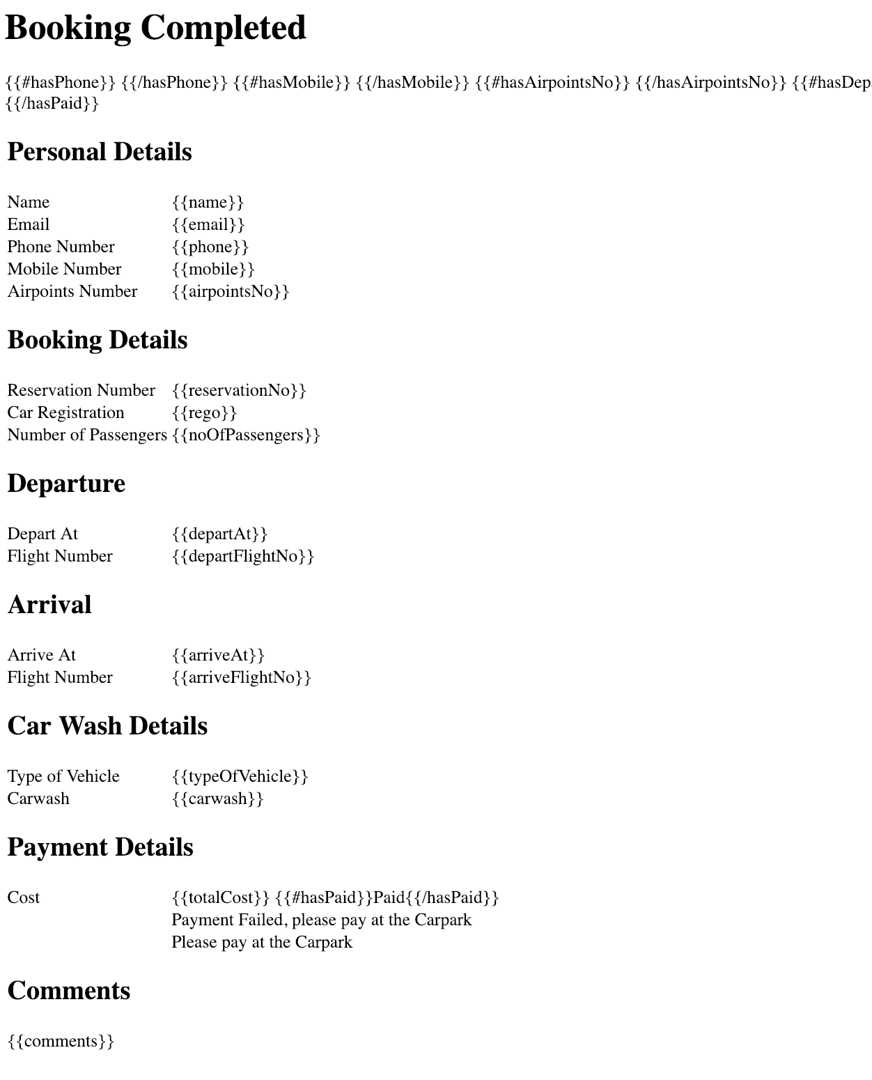
Original form content
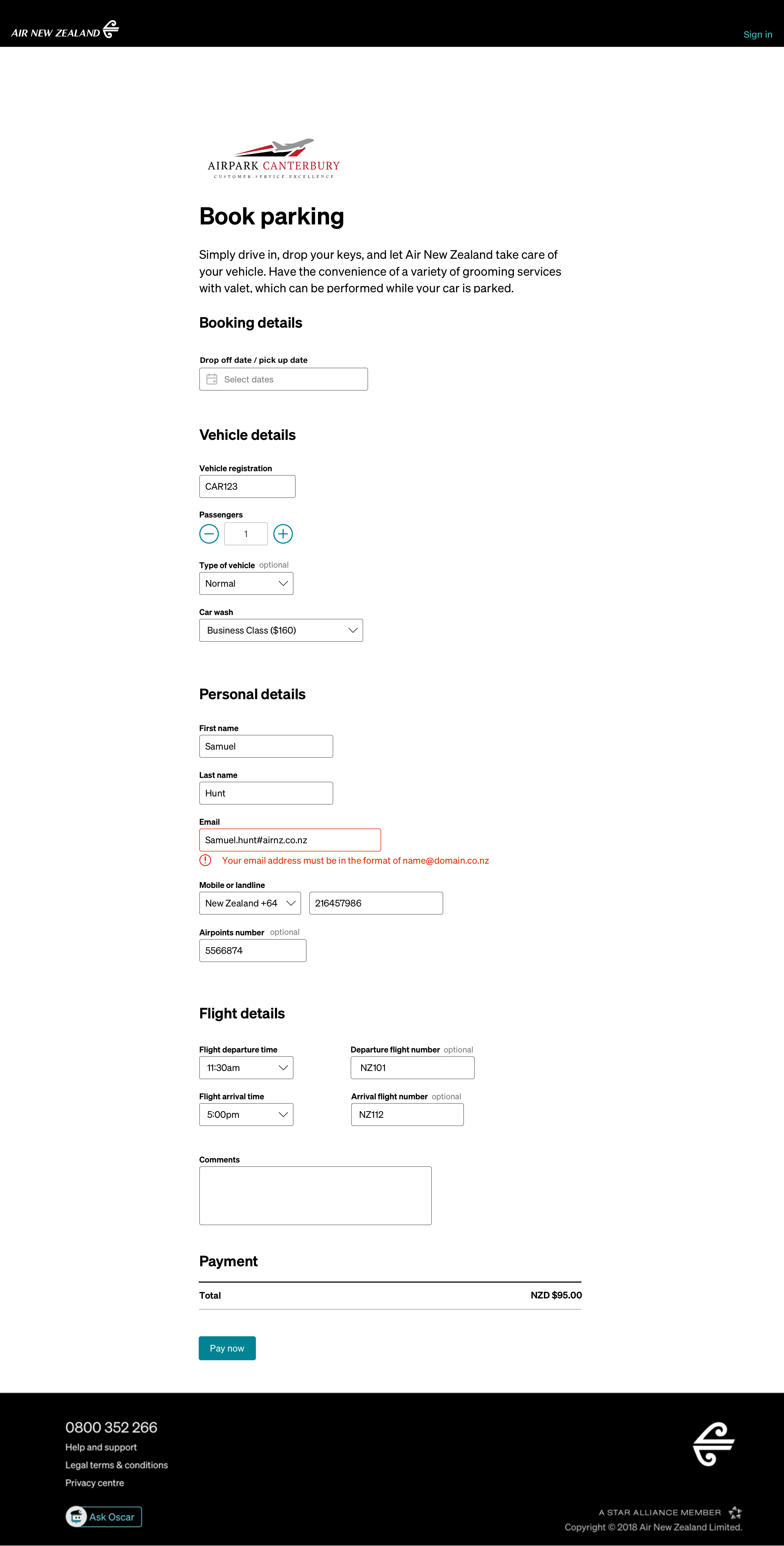
A major recommendation was given to turn the form into a booking flow just like our other products. This decision made sense, however due to developmental reasons could not be completed. I had already prepared for this unfortunate news in advanced, and so I supplied the product manager with an interim one page form (like the original layout) but with a few changes in the data and way of collection.
I spent time analysing the form that we were originally supplied and found a few issues in it. When presenting this design to the product manager, I pointed out my concerns to them. Of course, i'm not a fan of just going into a meeting with problems, so I came with my proposed solution to the painpoints I found.
Some of these painpoints included:
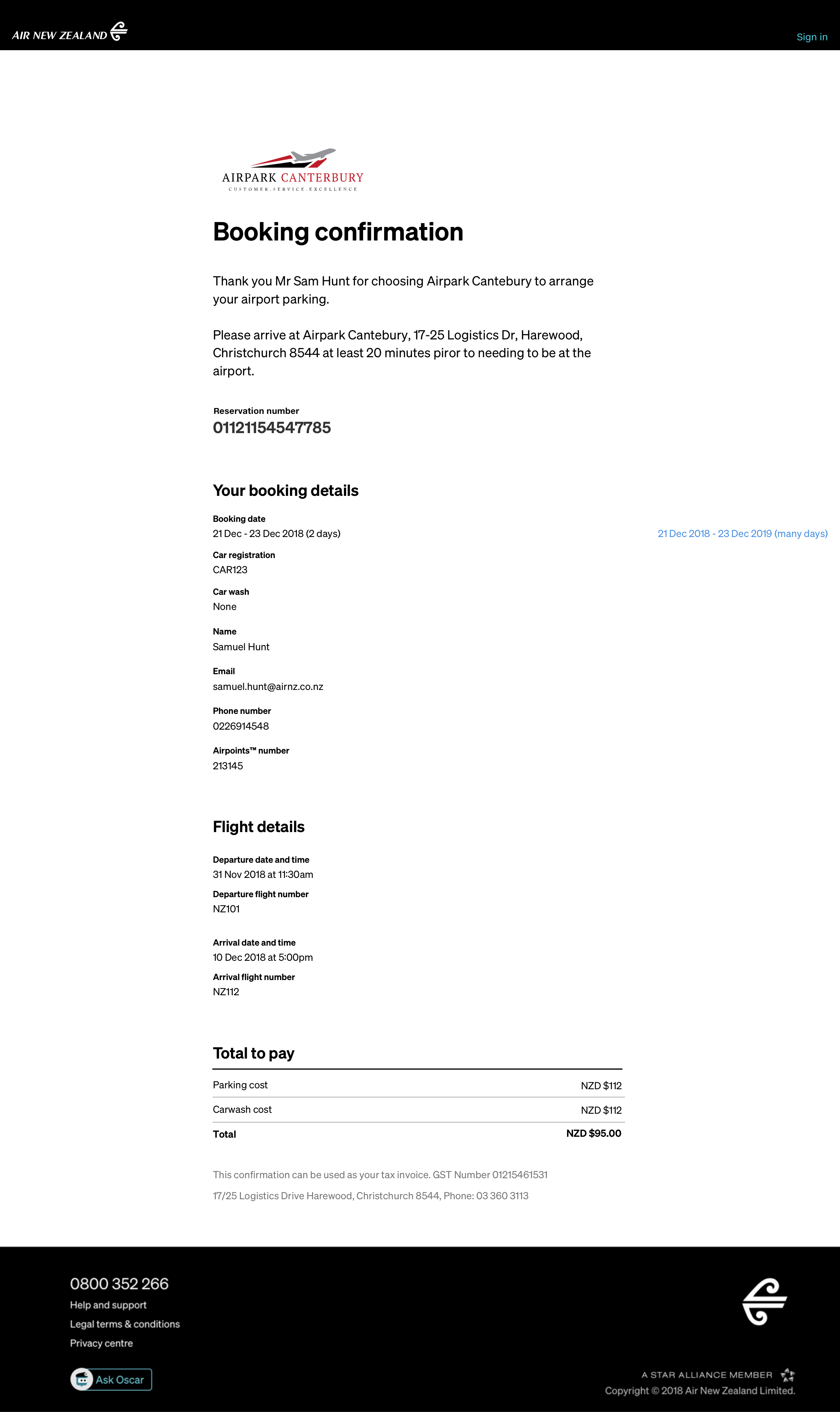
This confirmation page was designed to easily port across to an email as well. It has all of the required information from the booking.
The unfortunate thing about having a UX designer join the project late is that many crucial things regarding the user experience may get missed and the design that is recommended can't get delivered before the deadline due to other requirements. This project taught me a lot about how to compromise and create a design that requires as little development work as needed but still delivers a high quality product. I also began to create the recommended version of the product so that when resources are available, the designs are there ready to go.
Working with a contractor from another third partyThe developer that was creating this form was contracted by the third party to develop the page. Unfortunately, this meant that all of our communications had to be via email, and their knowledge on both our systems or the third parties was limited. This created a unique problem when proposing any changes to the form.
The developer didn't have the knowledge or confidence to make many big changes, as he didn't understand the backend system that was operating behind this page.
We did our best to streamline the process that customers will have to go through as best as we could with this massive limitation.